
Interior paint design is more than slapping a fresh coat on the walls, it’s the fastest, most budget-friendly way to redefine how a space feels and functions. Done right, paint can make low ceilings feel taller, small rooms appear larger, and boring boxes turn into rooms with real personality. Done wrong, it can make a room feel cramped, cold, or just plain awkward. Whether tackling a single accent wall or reimagining an entire floor plan, understanding the fundamentals of color theory, finish selection, and application technique separates a confident DIYer from someone stuck with buyer’s remorse and five leftover gallons.
Table of Contents
ToggleKey Takeaways
- Interior paint design fundamentals—color temperature, light reflectance value (LRV), and finish sheen—determine whether a space feels larger, cozier, or more sophisticated.
- Match paint colors and finishes to room function: neutral tones for kitchens, calming hues for bedrooms, and moisture-resistant satin or semi-gloss finishes for bathrooms and high-traffic areas.
- Accent walls and design techniques like color blocking or ombré work best when they highlight architectural features or focal points rather than random walls.
- Proper surface preparation—washing, sanding, and priming—is essential to avoid peeling and ensure quality coverage, making it worth the extra time upfront.
- Test paint samples in natural light for at least 48 hours before committing, as color perception shifts dramatically throughout the day and varies by room exposure.
- Invest in quality paint with high solids content and proper tools like 9-inch rollers and angled brushes to achieve professional results without excessive coats or touch-ups.
Understanding Interior Paint Design Fundamentals
Paint design starts with understanding three core elements: color temperature, light reflectance value (LRV), and finish sheen. Color temperature refers to whether a hue reads warm (reds, oranges, yellows) or cool (blues, greens, purples). Warm tones advance visually, making walls feel closer: cool tones recede, opening up tight spaces.
LRV measures how much light a paint color reflects on a scale of 0 (pure black) to 100 (pure white). Colors with an LRV below 50 absorb more light and work well in large, bright rooms. Above 50, they reflect light and help smaller or dim spaces feel airier. Most paint manufacturers list LRV on color cards or websites, use it.
Finish sheen impacts both appearance and durability. Flat or matte hides wall imperfections but marks easily: it’s best for low-traffic areas like adult bedrooms or ceilings. Eggshell and satin offer slight sheen and are washable, ideal for living rooms, dining rooms, and hallways. Semi-gloss and gloss are durable and moisture-resistant, making them the go-to for trim, doors, kitchens, and bathrooms. Mixing finishes, matte walls with semi-gloss trim, adds subtle architectural depth without extra cost.
Choosing the Right Paint Colors for Each Room
Room function and natural light should dictate color choices, not just what’s trending on Pinterest. Kitchens benefit from whites, soft grays, or muted greens that stay neutral as cabinet and countertop styles evolve. Avoid overly saturated colors that compete with food or make the space feel dated quickly, choosing the right kitchen palette affects both resale value and daily mood.
Bedrooms handle deeper, more personal hues well. Soft blues and greens promote calm: warm terracottas and blush tones add coziness without feeling heavy. Test samples on at least two walls, one that gets morning light and one that’s shaded in the afternoon. Colors shift dramatically depending on exposure.
Living rooms and dining spaces are where you can take calculated risks. Mid-tone neutrals (greiges, taupes, warm grays) provide flexibility for swapping out furniture and decor. If going bold, consider the room’s architectural features: a well-designed living room wall can support dramatic color without overwhelming the space.
Bathrooms and other high-moisture areas need paint formulated with mildewcide. Lighter colors help small powder rooms feel less claustrophobic, but don’t shy away from moody darks in larger bathrooms with good ventilation and lighting. Always use satin or semi-gloss in wet areas, flat paint will peel.
Popular Interior Paint Design Techniques and Finishes
Beyond solid color, several techniques add texture and visual interest without requiring advanced skills. Color blocking, painting geometric shapes or horizontal bands, creates modern, graphic impact. Use low-tack painter’s tape (the blue or green stuff rated for delicate surfaces) and remove it while the paint is still slightly tacky to avoid peeling.
Ombré or gradient walls transition one color into another, top to bottom. This takes patience: blend wet paint with a damp sponge or roller in overlapping horizontal strokes, working in small sections. It’s a weekend project, not a quick refresh.
Two-tone walls, a darker lower half with lighter upper, separated by trim or a chair rail, add traditional elegance or a craftsman vibe depending on color choices. The dividing line typically sits 32–36 inches from the floor. If there’s no existing chair rail, install 1×3 or 1×4 pine trim before painting and finish it in semi-gloss white or a contrasting accent color.
For subtle texture, consider faux finishes like sponging, ragging, or stippling. These were overdone in the ’90s but are making a comeback in muted, monochromatic palettes. Practice on drywall scraps or poster board before committing to a full wall. Techniques featured in creative paint tutorials often show how small changes in application create drastically different effects.
Accent Walls and Feature Wall Strategies
An accent wall works when it highlights an architectural feature or focal point, a fireplace, the wall behind a bed, or a built-in bookshelf. Painting a random wall just because it’s visible from the front door rarely pays off.
Choose the darkest or most saturated color for the accent, then pull one or two lighter tones from the same color family for surrounding walls. This keeps the space cohesive. A common mistake is going too bold without testing: a color that looks perfect on a 2×2-inch swatch can feel overwhelming across 120 square feet.
Vertical or horizontal stripes on a feature wall can alter perceived room dimensions. Vertical stripes make ceilings feel higher: horizontal stripes widen narrow rooms. Use a laser level and painter’s tape to keep lines crisp. For best results, paint the lighter base color first, tape off stripes, then apply the darker shade. Remove tape at a 45-degree angle while the top coat is still wet.
Creating Visual Flow Through Color Coordination
Open floor plans and adjoining rooms need intentional color flow to avoid a disjointed, choppy feel. The simplest strategy: choose a neutral base for main walls (a soft white, greige, or warm gray) and vary accent colors by room function while keeping undertones consistent.
If the living room has cool gray walls, don’t jump to a warm beige in the adjacent dining area, the transition will feel jarring. Instead, shift to a slightly deeper cool gray or introduce a blue-gray. Interior design cohesion often hinges on subtle tonal shifts rather than stark contrasts.
Trim and ceiling color also affect flow. Painting all trim and doors the same white or off-white throughout the house creates continuity. Ceilings don’t always need to be builder-grade white, try a color that’s 50–75% lighter than the wall shade for a cocooning effect, especially in bedrooms or home offices.
For homes with strong architectural detailing, crown molding, wainscoting, coffered ceilings, consider a monochromatic scheme using three shades of the same color. Paint trim the lightest, walls mid-tone, and feature elements (like board-and-batten panels) the deepest. This approach, popular in minimalist interiors, emphasizes craftsmanship without busy patterns or competing hues.
Common Interior Paint Design Mistakes to Avoid
Skipping surface prep is the number one DIY failure point. Paint won’t adhere to glossy, dirty, or damaged surfaces. Wash walls with a TSP substitute, sand glossy areas with 120-grit sandpaper, fill holes with lightweight spackling, and spot-prime patches with a PVA primer before applying finish coats. Cutting corners here guarantees peeling or uneven coverage.
Using cheap paint to save money costs more in the long run. Budget paints require three or four coats to achieve the same coverage and durability as two coats of a quality product. Look for paints with a high solids content (30–45% by volume) and built-in primer for one-coat coverage on previously painted surfaces.
Ignoring lighting when choosing color is another common mistake. Paint samples should be tested in the actual room for at least 48 hours, observed in morning, afternoon, and evening light. North-facing rooms get cool, indirect light that makes warm tones look muddy: south-facing rooms flood with warm light that intensifies yellows and reds. LED bulbs with a color temperature of 2700–3000K (warm white) are closest to incandescent and won’t skew color perception.
Don’t paint an entire room the same bold color unless it’s large and gets ample natural light. Instead, use bold shades on one or two walls and temper the rest with neutrals. And never assume sample pots match the final product, buy a quart of the actual paint and test a 2×2-foot section.
Finally, mixing finishes carelessly creates a DIY look in the worst way. Flat ceilings, eggshell or satin walls, and semi-gloss trim is the standard hierarchy. Deviating from this (like using flat paint in a bathroom or gloss on living room walls) usually backfires.
DIY Tips for Executing Your Paint Design Vision
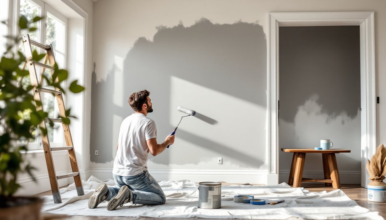
Start by gathering the right tools. A 9-inch roller with a 3/8-inch nap works for most smooth to lightly textured walls: use 1/2-inch nap for heavier texture. A quality 2.5-inch angled brush is essential for cutting in around trim, corners, and ceilings. Cheap brushes shed bristles and leave streaks, spend the extra $10.
Painter’s tape isn’t optional. Use 14-day or 21-day delicate-surface tape to avoid pulling off existing paint. Apply tape with firm pressure, especially along the edge that will meet wet paint. For ultra-sharp lines, run a thin bead of the base wall color along the tape edge, let it dry, then apply the top color. This seals the tape and prevents bleed-through.
Always prime new drywall, patched areas, or when making a dramatic color change (dark to light or vice versa). A gray-tinted primer works well under bold colors: white primer is fine under pastels and neutrals. One coat of primer plus two finish coats is the standard formula for professional results.
Cut in first, then roll. Paint a 3–4 inch border around trim, corners, and ceilings with a brush, then immediately roll the field before the cut-in dries. This wet-edge technique prevents lap marks. Roll in a W pattern, filling in without lifting the roller, to distribute paint evenly and avoid streaks.
Ventilation matters. Open windows and use a box fan to exhaust fumes, especially with oil-based or low-VOC paints that still off-gas. Wear a respirator with organic vapor cartridges if using shellac-based primers or oil finishes in enclosed spaces, dust masks won’t cut it.
For complex designs like stripes, color blocking, or patterns inspired by creative techniques, work slowly and double-check measurements. A laser level is worth the $30 investment for layouts that require precision. If the design involves multiple colors, paint lightest to darkest to minimize touch-ups.
Finally, clean tools immediately. Latex paint cleans with warm soapy water: oil-based requires mineral spirits. Dried paint ruins brushes and rollers, and quality tools should last years with proper care.