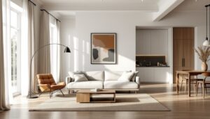

The clothes you wear and the rooms you live in share more DNA than you might think. Both are canvases for self-expression, built on the same principles of color theory, proportion, and texture. If you’ve ever noticed how a navy blazer and camel trousers combo feels just as balanced as a blue sofa against tan walls, you’re already fluent in the language that connects fashion and interior design. This guide breaks down how to translate your personal style, from the wardrobe you’ve spent years refining, into a home that feels authentically you, not like a catalog copy.
Table of Contents
ToggleKey Takeaways
- Your personal style in fashion and interior design follows the same principles of color theory, proportion, and texture, making your wardrobe a reliable blueprint for designing a cohesive home.
- Extract your true color palette by analyzing your most-worn clothing items, then translate those dominant colors into walls and furniture while using accent colors from your accessories in smaller decor pieces.
- Pattern and texture mixing rules are identical in both fashion and interior design—vary scales, layer contrasting textures, and stick to one pattern family to create visual interest without clashing.
- Current trends like dopamine decorating, maximalism, sustainability, and gender-neutral design now bridge both fashion runways and living rooms, signaling a unified shift in how we express style across mediums.
- Create a cohesive home by identifying a signature design element that anchors both your wardrobe and rooms, then use physical or digital style files to ensure consistency across your personal aesthetic.
- Edit and invest ruthlessly in pieces that serve your vision, treating interior design like personal styling—where the right proportions, lighting, and curated selections matter more than trend-chasing or adding unnecessary items.
The Natural Connection Between Fashion and Interior Design
Fashion designers have long understood that their aesthetic sensibility doesn’t stop at clothing. Many have successfully launched home collections, proving the principles that guide a hemline work just as well on a headboard. Color harmony, silhouette, proportion, and material choice apply whether you’re draping fabric on a body or upholstering a chair.
Both disciplines rely on balancing visual weight. A chunky knit sweater paired with slim jeans uses the same eye as a substantial sectional grounded by sleek side tables. Pattern scale matters in both contexts, oversized florals can overwhelm a petite frame or a small powder room, while delicate prints add refinement without stealing the show.
The mood you create with fashion translates directly to interiors. Someone drawn to tailored minimalism in their wardrobe, think structured blazers, neutral palettes, and clean lines, will likely feel most at home in spaces with streamlined furniture, uncluttered surfaces, and a restrained color scheme. Conversely, those who layer prints, textures, and vintage finds in their outfits often thrive in eclectic interiors that mix eras and styles.
This connection isn’t just aesthetic, it’s practical. Your closet is a working archive of the interior design trends you’ll gravitate toward. The colors you reach for on Monday morning offer clues about the wall paint that’ll make you feel most comfortable on Sunday afternoon.
How to Translate Your Fashion Style Into Home Decor
Color Palettes: Borrowing From Your Wardrobe
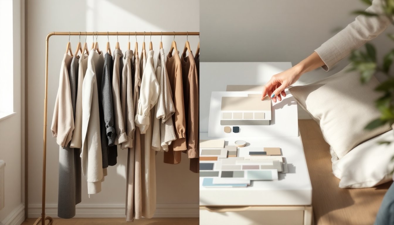
Start by laying out your ten most-worn pieces of clothing. Notice a pattern? That’s your true color palette, stripped of aspirational Pinterest boards and trend forecasts. If your closet leans toward charcoal, olive, and cream, those neutrals form a solid foundation for walls, large furniture pieces, and flooring. Accent colors, the rust scarf you always grab, the cobalt shoes that make you smile, translate into throw pillows, artwork, and smaller decor items.
Paint companies understand this crossover. Many interior paint lines now reference fashion color trends in their annual collections, using names borrowed from textile terminology. A “cashmere” gray or “linen” white isn’t just marketing, it signals a specific undertone that mimics fabric.
Don’t ignore your metals and hardware preferences. If you only wear gold jewelry, brushed brass cabinet pulls and warm-toned light fixtures will feel more natural than chrome or nickel. Same logic applies to watch styles, someone who prefers leather bands over metal bracelets might lean toward wood furniture and woven textures rather than glass and steel.
One practical tip: take a photo of your closet’s color distribution and use it as a reference when shopping for paint, fabric, or furniture. Your phone’s camera roll becomes a surprisingly accurate mood board.
Texture and Pattern Mixing Across Fashion and Interiors
The rules for mixing patterns in an outfit apply directly to a room. Start with varying scales, if you’re pairing a striped shirt with a plaid blazer, the stripes and plaids should differ in size. In your dining room interior, that translates to pairing large-scale curtain patterns with smaller geometric rug designs.
Texture layering works identically in both worlds. A velvet jacket over a cotton tee, finished with a leather belt, creates tactile interest the same way velvet dining chairs, linen napkins, and a wood table do. The key is contrast, smooth against rough, matte beside sheen.
Pattern families help maintain cohesion. Fashion stylists often stick to one pattern “genre” per outfit, all geometric, all organic, or all linear. Apply that to interiors by choosing patterns from the same family across a room. If you go with botanical prints, keep them all in that natural category rather than mixing in stripes or abstract art.
One mistake to avoid: overmatching. Fashion’s moved past matchy-matchy sets, and interiors should too. A bedroom where the duvet, curtains, and throw pillows are all the same fabric reads as flat as a head-to-toe denim outfit. Instead, pick a dominant pattern and let others complement in different scales or colorways.
Current Trends Bridging Runways and Living Rooms
Dopamine dressing, the fashion trend of wearing bold, joy-sparking colors, has jumped straight into home decor as “dopamine decorating.” Think saturated jewel tones, unexpected color blocking, and playful furniture shapes that prioritize mood over matchy-matchy restraint. If you’ve been wearing more saturated pinks, electric blues, or saffron yellows lately, your walls might be ready for that same energy.
Sustainability connects both industries more than ever. The same consumers buying secondhand clothing and demanding transparent supply chains now want eco-conscious furniture and materials. Vintage and antique pieces aren’t just budget-friendly, they’re the interior equivalent of thrift-store fashion finds, offering character that new mass-production can’t match. Publications like Architectural Digest increasingly feature designers who prioritize reclaimed materials and heirloom-quality craftsmanship.
Maximalism is having a moment in both closets and living rooms. After years of minimalist neutrals dominating fashion runways and Danish interior design aesthetics, 2026 celebrates more-is-more. Layered jewelry, clashing prints, and statement accessories mirror interiors packed with gallery walls, collected objects, and fearless pattern mixing. This isn’t clutter, it’s curation with confidence.
Gender-neutral design has moved from fashion into interiors. The same fluid approach that’s blurred menswear and womenswear boundaries now shapes furniture and color choices. Blush pinks pair with deep charcoals, curved furniture sits alongside angular pieces, and rooms are designed for function rather than outdated “masculine” or “feminine” labels.
The resurgence of specific decades in fashion, particularly 90s interior nostalgia, shows up as renewed interest in sculptural furniture, bold primary colors, and the kind of optimistic design that defined that era. Meanwhile, 70s-inspired spaces echo the current fashion love affair with wide-leg pants, earth tones, and organic shapes.
Practical Tips for Creating a Cohesive Look Throughout Your Home
Start with a signature element that anchors both your wardrobe and your rooms. Maybe it’s always black-and-white combinations, or a recurring pop of red, or a preference for natural materials like linen and wood. This becomes your through-line, the detail that makes spaces feel intentionally connected rather than randomly decorated.
Create a physical or digital style file that includes both fashion and interior images. When you spot a Design Milk feature with a room that speaks to you, save it next to outfit photos you love. Patterns emerge, maybe you’re drawn to Scandinavian minimalism in both, or bohemian layering, or industrial edge. These aren’t coincidences: they’re your aesthetic preferences showing consistency across mediums.
Invest in transition pieces that literally bridge fashion and interiors. Throw blankets in patterns you’d wear as scarves. Decorative pillows in fabrics that match your favorite jacket textures. Even something as simple as displaying jewelry on a dresser becomes decor that reinforces your style.
Respect room function like you respect dress codes. You wouldn’t wear a sequined gown to a hardware store, and you shouldn’t force a high-maintenance white sofa into a household with kids and pets. Practical doesn’t mean boring, it means choosing durable performance fabrics in colors you love, just like selecting machine-washable work clothes in your preferred palette.
Pay attention to the architecture of your furniture. Fashion considers body proportions: interiors demand attention to ceiling height, room dimensions, and traffic flow. A low-slung sectional might echo the relaxed fit of your favorite jeans, but not if your ceilings are only 8 feet tall, you’ll need furniture with taller backs or vertical elements to balance the space.
Don’t ignore lighting, which functions like accessories in fashion. The right light fixtures can completely change a room’s mood, just like swapping sneakers for boots transforms an outfit. Consider both ambient (overhead), task (reading lamps), and accent (picture lights) layers, using fixture styles that match your aesthetic, industrial pendants for urban edge, crystal chandeliers for glamour, woven shades for bohemian warmth.
Finally, edit ruthlessly. Fashion stylists talk about removing one accessory before leaving the house. Apply that to rooms by regularly purging items that don’t serve your vision. A cohesive home, like a refined personal style, often comes from subtraction rather than addition.
Conclusion
The best homes don’t follow someone else’s rulebook, they extend the person who lives there. When your interior choices reflect the same instincts that guide your wardrobe, decorating becomes less about trends and more about trusting what already works. Start with the colors, textures, and proportions you naturally gravitate toward when getting dressed, then let those preferences guide your paintbrush and furniture choices. The result won’t just look good, it’ll feel like you.