
Walking into a room painted in shades of beige and gray can feel safe, and utterly forgettable. Colorful interior design flips that script, turning ordinary spaces into energizing, personality-packed environments that reflect who you actually are. Whether you’re considering a vibrant accent wall, jewel-toned furniture, or a full-room color story, bold hues offer more than eye candy, they shift mood, define zones, and make small rooms feel intentional instead of cramped. This guide walks through the practical side of going bold: choosing palettes that work, applying color strategically room by room, and balancing saturation with neutrals so your space feels curated, not chaotic.
Table of Contents
ToggleKey Takeaways
- Colorful interior design transforms ordinary spaces by shifting mood, defining zones, and adding personality without expensive architectural changes like crown molding.
- Use the 60-30-10 color rule: one dominant hue (60%), secondary color (30%), and accent (10%) to create cohesive, balanced rooms that avoid visual chaos.
- Apply color strategically by room—bold accent walls energize living areas, moody deep hues create restful bedrooms, and color zoning separates spaces in open-concept layouts.
- Balance saturated wall colors with neutral elements like natural flooring, textiles, and furniture to keep spaces grounded and allow for seasonal decor swaps.
- Test paint samples in different light exposures and start with low-commitment options like peel-and-stick wallpaper, removable decals, or bold furniture before painting permanent walls.
Why Colorful Interior Design Works in Modern Homes
Color does more than decorate, it alters perception. Saturated hues can make a cavernous living room feel intimate, while lighter, warm tones expand tight spaces visually. Modern open-floor plans benefit especially from color zoning: a burnt orange dining nook signals “gather here,” while a soft sage kitchen corner whispers calm.
Psychology backs this up. Blues lower heart rate and work well in bedrooms: yellows stimulate conversation in kitchens and dining areas: deep greens ground home offices. You’re not just painting walls, you’re programming how a room feels at 7 a.m. versus 7 p.m.
There’s also a practical angle. Neutral-heavy homes photograph well but often lack character in person. Bold color creates focal points without requiring expensive architectural changes. A terracotta accent wall behind a sofa does the work of crown molding at a fraction of the cost and effort. Plus, paint is reversible. If the coral experiment fails, you’re out a Saturday and two gallons of primer, not a kitchen remodel budget.
Many homeowners exploring 2024 living room trends find that bold color anchors furniture arrangements and defines style faster than accessories alone.
Choosing Your Color Palette: Popular Schemes and Combinations
Start with a three-color rule: one dominant hue (60% of the room), one secondary (30%), and one accent (10%). This ratio keeps things cohesive without feeling like a preschool classroom.
Complementary palettes use opposites on the color wheel, think navy and burnt orange, or plum and mustard. These create high contrast and energy, ideal for living rooms or creative spaces. They’re bold but balanced when you let one color lead and use the other sparingly in pillows, art, or trim.
Analogous schemes pull neighboring colors, teal, blue, and violet, for instance. These feel harmonious and flow naturally, making them smart for open-concept layouts where rooms bleed into each other. The risk? Going too matchy. Break it up with texture: a blue velvet sofa, teal linen curtains, and a violet wool rug read as layered, not monotonous.
Triadic palettes (three evenly spaced hues, like red-yellow-blue) are trickier but stunning when executed well. Use one as the dominant color, another in furniture or cabinetry, and the third as a small accent. Without that hierarchy, rooms feel scattered.
Test paint samples on at least two walls, one that gets morning light, one that sees afternoon sun. Colors shift dramatically depending on exposure. Sherwin-Williams and Benjamin Moore both offer peel-and-stick sample sheets that save you from painting dozens of squares directly on drywall.
Resources like Home Bunch showcase curated color palettes in real homes, which helps translate theory into livable design that accounts for flooring, trim, and existing furniture.
Room-by-Room Color Application Strategies
Living Rooms and Common Areas
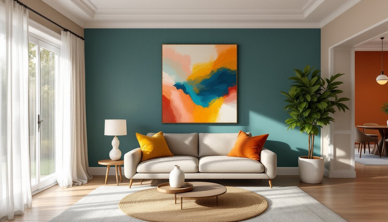
Living rooms handle the most traffic and moods, so color needs to work overtime. Accent walls are the go-to move here, choose the wall behind your sofa or the one facing the entry. This keeps the room from feeling closed-in while still delivering impact.
For open-concept spaces, use color to define zones without adding walls. A deep teal on the living room’s back wall and a warm terracotta in the dining area create visual separation. Keep the connecting walls neutral (white, greige, or soft linen) so transitions feel intentional, not jarring.
Ceilings are an underused opportunity. A fifth wall painted in a soft blush or sky blue draws eyes up and makes standard 8-foot ceilings feel taller. Avoid dark colors here unless you’re working with 10+ foot ceilings and want a cozy, enveloping vibe.
Trim and baseboards matter more than most DIYers realize. Painting them in a contrasting semi-gloss (say, crisp white against a charcoal wall) sharpens lines and gives the room architectural definition. If your trim is beat-up or narrow, a coat of Benjamin Moore Advance in a complementary color can fake better millwork.
Consider how furniture plays into the palette. A jewel-toned wall looks intentional with neutral upholstery: pair it with equally saturated furniture and you risk visual noise. When planning living room wall treatments, factor in the fixed elements like flooring and built-ins before committing to a bold paint choice.
Bedrooms and Private Spaces
Bedrooms can handle deeper, moodier palettes than most people expect. A room painted in charcoal, forest green, or navy feels cocoon-like and restful, especially when paired with warm-toned wood furniture and soft textiles. The key is layering: all-dark walls need lighter bedding and at least two light sources (bedside lamps and overhead) to avoid dungeon vibes.
If full saturation feels risky, try a color-drenched approach: paint the walls, ceiling, and trim all the same hue. This monochrome method blurs edges and makes small bedrooms feel larger and more cohesive. Soft sage, dusty rose, or powdery blue work especially well here.
Kids’ rooms are prime real estate for bold color, but skip the primary-color chaos. Instead, use one saturated wall (a sunny yellow or bright coral) and keep the other three neutral. This gives kids visual stimulation without overstimulation, and it’s easier to age up as they grow.
For home offices tucked into bedrooms, color can separate work from sleep. Paint the desk wall a different hue or use peel-and-stick wallpaper to create a distinct work zone. Warmer tones (terracotta, mustard) energize focus, while cooler ones (soft gray-blue, muted green) promote calm concentration.
Many homeowners drawing inspiration from mid-century modern design embrace bold bedroom colors paired with clean-lined furniture and minimal clutter for a balanced, intentional look.
Balancing Bold Colors with Neutral Elements
All color, no breathers? That’s how bold design tips into overwhelming. Neutrals, white, beige, gray, black, aren’t boring: they’re structural. Think of them as the studs behind your drywall: invisible but essential.
Use the 60-30-10 rule in reverse if you’re nervous. Let neutrals dominate (60% beige walls, natural wood floors), add a secondary color in mid-tones (30% dusty blue sofa), and punch it with bold accents (10% mustard pillows, burnt orange throws). This keeps the room grounded and lets you swap accent colors seasonally without repainting.
Floors and ceilings should almost always stay neutral unless you’re very confident. A colorful floor (like painted wide-plank pine in sage green) works in a cottage or coastal home but can date quickly. Similarly, bold ceilings need high ceilings and a minimalist room to succeed, otherwise they just press down visually.
Texture is your friend. A neutral linen sofa, jute rug, and raw wood coffee table add depth and warmth without competing with a saturated wall color. When in doubt, add more texture before adding more color.
Window treatments balance color temperature. If your walls skew cool (blues, greens), warm-toned curtains (cream, caramel, rust) soften the space. Conversely, cool-toned drapes (gray, charcoal, white) temper warm walls (terracotta, mustard, coral). Blackout curtains in bedrooms should be neutral, bold patterns or colors here fight with your accent wall and muddy the overall palette.
For ideas on balancing bold color with classic forms, dining room designs often demonstrate how neutral furniture and flooring let colorful walls or artwork take center stage without competing for attention.
DIY Tips for Adding Color Without Commitment
Not ready to paint? Start with removable options that deliver impact without the permanence.
Peel-and-stick wallpaper has come a long way. Brands like Tempaper and RoomMates offer bold patterns and saturated colors that install in an afternoon and remove without damaging drywall. Use it on a single accent wall or inside a bookcase for a pop of surprise color. Make sure walls are clean and primed: it adheres poorly to flat, chalky paint.
Removable wall decals work well for geometric patterns or large-scale botanicals. They’re especially smart for renters or anyone testing a color concept before committing to paint. Application requires patience, smooth from the center out to avoid bubbles, but removal is as simple as peeling slowly at a 45-degree angle.
Large-scale art and textiles are the fastest color injection. A 6×9-foot area rug in a bold pattern anchors a neutral room instantly. Oversized canvas art (40×60 inches or larger) creates a focal point without a single paint stroke. Designers from House Beautiful often highlight how large artwork can serve as the foundation for an entire room’s color scheme.
Furniture reupholstery and slipcovers let you test saturated color on a smaller scale. A jewel-toned velvet slipcover on a neutral sofa is reversible: a full reupholstery job isn’t. If sewing isn’t your thing, companies like Comfort Works offer custom-fit slipovers in hundreds of fabrics.
Cabinet and furniture paint transforms kitchens and bathrooms without demo. Painting lower cabinets in a bold hue (navy, forest green, charcoal) while keeping uppers neutral is a proven formula. Use a bonding primer (like Zinsser B-I-N or Sherwin-Williams Extreme Bond) and a durable topcoat rated for kitchens and baths. Sand lightly between coats and let cure for a full week before heavy use.
Temporary color via decor swaps is the simplest play. Swap neutral pillows for saturated ones, replace light fixtures with colorful pendants, or paint a thrifted dresser in a bold hue. These changes are low-risk and budget-friendly, and they teach you how you actually live with color before tackling walls.
For more DIY-friendly inspiration that balances boldness with accessibility, Homedit features approachable projects and colorful room transformations that don’t require contractor-level skills.
Renters should check lease terms before any paint or adhesive application. Some landlords allow paint if you return walls to the original color at move-out: others don’t. When in doubt, get written permission. The deposit you save is worth the email.