
Brown isn’t just back, it’s commanding attention in living rooms, kitchens, and bedrooms from coast to coast. After years of stark whites and cool grays dominating interiors, homeowners are rediscovering the warmth, versatility, and sophistication that brown brings to a space. Whether it’s the honey tones of natural oak, the richness of espresso-stained cabinetry, or the earthiness of terracotta, brown grounds a room while offering surprising flexibility. This shift isn’t nostalgia: it’s a deliberate move toward creating homes that feel lived-in, layered, and genuinely comfortable. Here’s how to work with brown, from choosing the right shade to pairing it with materials and colors that make it shine.
Table of Contents
ToggleKey Takeaways
- Brown interior design is making a major comeback as homeowners shift from sterile neutrals to warmer, more grounded aesthetics that feel genuinely comfortable and restorative.
- Light browns like taupe and greige work best in smaller spaces with limited light, while rich dark browns like espresso and walnut require ample square footage and good lighting to avoid feeling cave-like.
- Brown pairs seamlessly with white, cream, green, and blue, making it a versatile neutral that encourages layering mixed materials and vintage pieces without visual clashing.
- Texture is essential to brown interior design success—combining varied wood species, leather, natural fibers, linen, and stone prevents a brown room from feeling flat or dated.
- Brown hides wear and maintenance issues like scuffs, fingerprints, and dust far better than light neutrals, making it practical for high-traffic family homes with kids and pets.
- Incorporate brown through accent walls, cabinetry, flooring, and statement furniture pieces rather than committing to it everywhere, and always balance darker shades with lighter walls or contrasting countertops to prevent the space from feeling too heavy.
Why Brown Is Making a Major Comeback in Interior Design
The renewed interest in brown stems from a broader cultural pivot toward organic, grounded aesthetics. After the pandemic pushed people to spend more time at home, design priorities shifted from showroom-perfect spaces to environments that feel genuinely restorative.
Brown delivers on that promise. Unlike sterile neutrals, brown tones, think walnut, camel, rust, and clay, evoke natural materials: wood grain, leather, stone, and soil. These associations trigger a psychological response tied to stability and comfort, which explains why chocolate brown is emerging as a favorite neutral in high-end interiors.
From a practical standpoint, brown hides wear better than white or light gray. Scuffs on a brown leather sofa blend in: fingerprints on brown-stained trim disappear. For families with kids, pets, or high-traffic zones, that’s not a luxury, it’s a necessity.
Brown also pairs seamlessly with the current trend toward mixed materials and vintage finds. A mid-century credenza in teak, reclaimed barn wood shelving, or a caramel-colored area rug all share brown as a common thread, making it easier to layer pieces without clashing.
Choosing the Right Shade of Brown for Your Space
Not all browns are created equal. The difference between a light taupe and a deep chocolate is as dramatic as the difference between primer and top coat. Start by assessing your room’s natural light, ceiling height, and existing finishes.
Light Browns and Neutrals
Light browns, taupe, beige, tan, sand, and greige (gray-beige hybrids), work well in smaller rooms or spaces with limited natural light. They reflect more light than darker shades, preventing a room from feeling closed in.
Use light browns on walls when you want warmth without drama. A greige wall color (look for undertones that lean warm, not cool) pairs beautifully with white trim and brass or black hardware. It’s a safer choice for bedrooms, bathrooms, or home offices where you want calm, not stimulation.
For flooring, light oak, birch, or maple planks in natural or whitewashed finishes offer durability and a clean backdrop for furniture. Nominal 3/4-inch solid hardwood or luxury vinyl plank (LVP) in light brown tones can visually expand a room while hiding dust better than white or very dark floors.
Rich, Dark Browns
Dark browns, espresso, mahogany, walnut, umber, and chocolate, bring weight and sophistication. They work best in rooms with ample square footage and good natural or layered artificial lighting. Without enough light, a dark brown room can feel cave-like rather than cozy.
Consider dark brown for accent walls, built-in cabinetry, or statement furniture pieces. A walnut credenza or espresso-stained shaker cabinets can anchor a dining room interior without overwhelming it, especially when balanced with lighter walls and flooring.
Dark brown trim and doors are gaining traction as an alternative to white. If you’re refinishing or replacing trim, a satin or semi-gloss finish in a deep brown can add architectural interest without the starkness of white. Just be aware: dark trim shows dents and dings more readily, so use primed hardwood or MDF if you’re DIYing, and apply multiple coats for durability.
How to Incorporate Brown Into Different Rooms
Brown’s versatility means it can show up in nearly any room, but the approach differs depending on function and traffic.
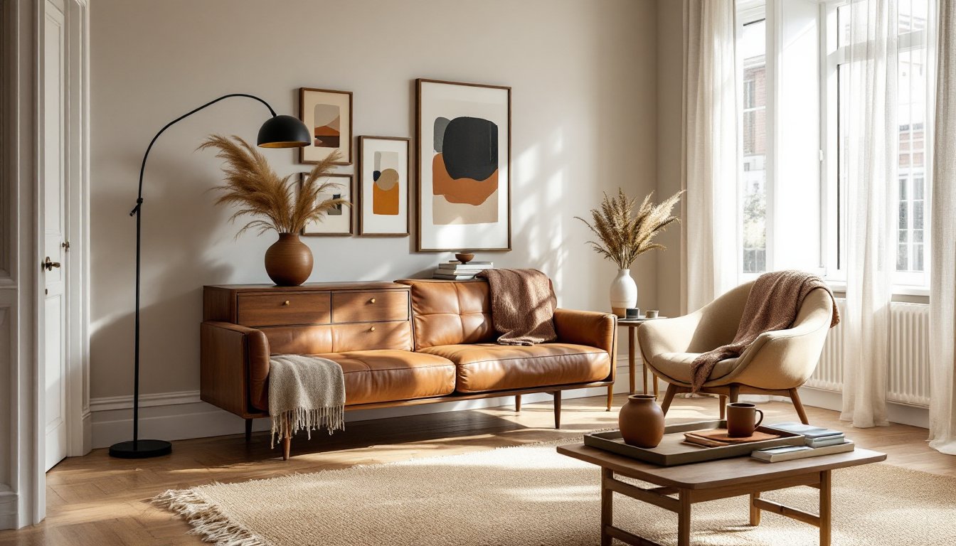
In living rooms, start with a brown sofa or sectional in leather or linen. Leather develops a patina over time, adding character: linen is softer and more casual. Layer in brown through wood furniture, area rugs, or window treatments. A jute or sisal rug in natural brown tones grounds a seating area and holds up well to foot traffic.
For kitchens, brown cabinetry is staging a comeback. Whether you choose stained oak, cherry, or walnut, pair it with contrasting countertops, white quartz or marble keeps things from feeling too heavy. If you’re not ready to commit to brown cabinets, try a brown tile backsplash in subway or zellige patterns. The variation in glaze adds depth without requiring a full remodel.
In bedrooms, brown works as both a grounding neutral and a sleep-friendly hue. Paint one wall in a warm mocha or taupe, or introduce brown through bedding, curtains, and nightstands. Avoid glossy finishes: stick with matte or eggshell paints to keep the mood restful.
Bathrooms benefit from brown in tile, vanity finishes, or accessories. Terracotta floor tiles paired with white walls and natural wood vanities create a spa-like feel. Just ensure adequate ventilation, wood in humid spaces needs proper sealing with polyurethane or a water-resistant finish to prevent warping.
For home offices, brown adds focus without distraction. A minimalist interior approach with brown wood desks, leather desk chairs, and warm wall tones creates a productive environment that doesn’t feel sterile.
Color Combinations That Perfectly Complement Brown
Brown is a chameleon, it plays well with nearly every color, but some pairings are especially effective.
Brown + white is classic and clean. It’s the easiest combination for beginners, offering high contrast without harshness. Use brown as the anchor (furniture, flooring) and white for walls, trim, and ceiling. Add texture through woven baskets, linen throws, or ceramic vases to prevent the palette from feeling flat.
Brown + cream or ivory softens the contrast, creating a more relaxed, layered look. This works beautifully in transitional style interiors where you want warmth without leaning too traditional or too modern.
Brown + green taps into nature. Olive, sage, or forest green paired with warm browns evokes an organic, earthy vibe. Use green in upholstery, plants, or painted accents like window frames or door panels.
Brown + blue offers unexpected sophistication. Navy or slate blue combined with caramel or tan creates a balanced, gender-neutral palette that works in living rooms or bedrooms. The cool blue tempers the warmth of brown, preventing it from feeling too cozy or overly rustic.
Brown + blush or terracotta is trending for those willing to embrace color. Dusty pink or burnt orange accents against a brown backdrop feel fresh and contemporary. Try this in textiles, throw pillows, area rugs, or curtains, before committing to paint.
Brown + black adds drama. This pairing works best in larger rooms with good lighting. Black window frames, light fixtures, or cabinet hardware can sharpen a brown-heavy space without overwhelming it.
For inspiration on pairing brown with other design trends, sites like MyDomaine and Home Bunch offer room-by-room examples of color combinations in real homes.
Materials and Textures That Enhance Brown Interiors
Brown thrives on texture. Without it, a brown room can feel flat or dated. Layering materials is what separates a well-executed brown interior from one that feels stuck in the ’80s.
Wood is the obvious choice, but vary the species and finish. Combine a walnut dining table with oak flooring and a pine accent wall treated with a clear matte sealer. Mixing wood tones used to be taboo: now it’s encouraged, as long as the undertones (warm vs. cool) are consistent.
Leather adds richness and ages beautifully. A brown leather sofa or armchair develops character over time. For a DIY project, consider reupholstering a thrift-store chair in brown leather or faux leather, it’s easier than fabric because leather doesn’t fray and requires fewer seams.
Natural fiber rugs, jute, sisal, seagrass, are durable and affordable. They add texture underfoot and complement brown furniture without competing visually. Note: natural fiber rugs can be rough: layer a softer cotton or wool rug on top in high-use areas.
Linen and cotton in brown tones keep things from feeling too polished. Use them in curtains, throw pillows, or bedding. Linen wrinkles naturally, which adds to its laid-back appeal, don’t fight it.
Stone and clay tiles in brown or terracotta work well in kitchens, bathrooms, and entryways. 12×24-inch porcelain tiles that mimic travertine or sandstone offer the look of natural stone with easier maintenance. For a backsplash, consider 3×6-inch subway tiles in a brown glaze with varied finishes for depth.
Metal accents in brass, bronze, or matte black can punctuate a brown room. Cabinet pulls, light fixtures, and curtain rods in these finishes add visual interest without introducing new colors. Brass warms up a space: black sharpens it.
Woven baskets and pottery in natural browns, think unglazed ceramic, rattan, or wicker, provide functional storage and reinforce the organic theme. Use them in living room wall designs as sculptural elements or in open shelving to break up rows of books or dishware.
When selecting materials, think about sheen as much as color. Matte finishes absorb light and feel softer: gloss or satin finishes reflect light and add energy. In a drawing room interior, you might mix a matte brown wall with a glossy brown ceramic lamp base for contrast.
Safety note: When working with stains, sealers, or finishes on wood or leather, always work in a well-ventilated area and wear a respirator mask rated for organic vapors, not just a dust mask. Many wood stains and polyurethanes contain volatile organic compounds (VOCs) that can irritate lungs and skin. Dispose of rags soaked in oil-based products properly, they can spontaneously combust if bunched up. Lay them flat to dry outdoors or submerge in water in a sealed metal container before disposal.
If you’re drawn to the clean lines and natural materials common in Scandinavian interior design or Danish interior design, brown tones in light oak, beech, and linen are foundational. These styles prove that brown doesn’t have to feel heavy, it can be airy, functional, and beautifully restrained.