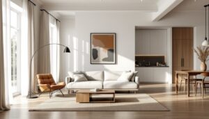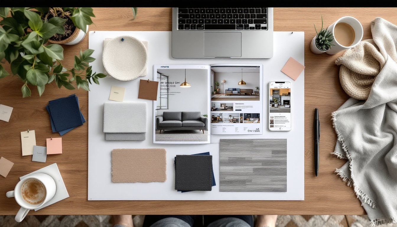

Before tearing down a single wall or ordering fabric swatches, designers and savvy DIYers do one thing: they build a moodboard. It’s not Pinterest-pretty fluff, it’s a planning tool that prevents expensive mistakes and keeps everyone on the same page. A well-made moodboard acts as a visual contract between what’s in your head and what’ll actually land in your space. Whether you’re tackling a single room refresh or a full-home renovation, starting with a moodboard saves time, money, and the headache of a paint color that looked “totally different in the can.”
Table of Contents
ToggleKey Takeaways
- An interior design moodboard is a visual planning tool that prevents costly mistakes by showing how colors, materials, furniture, lighting, and textures will work together before you commit to purchases.
- Include five to ten essential elements on your moodboard: flooring or large furniture samples, furniture silhouettes, lighting fixtures, actual paint chips, and fabric swatches representing your 60-30-10 color ratio.
- Test your physical moodboard in the actual room at different times of day, since colors shift dramatically under various lighting conditions—avoiding expensive regrets before ordering materials.
- Edit ruthlessly and limit your moodboard to focused design choices rather than collecting 30+ inspiration images, ensuring clarity and preventing conflicting room concepts.
- Mix three to five distinct textures (smooth, textured, matte, glossy) to add visual depth and keep the space from feeling flat or chaotic.
- Use a hybrid approach for the best results: build your interior design moodboard digitally for flexibility and sharing, then order physical samples of final choices to verify accuracy under real lighting conditions.
What Is an Interior Design Moodboard and Why You Need One
A moodboard is a visual collage that brings together colors, materials, furniture styles, lighting, and textures into a single reference document. Think of it as a blueprint for the feel of a room, not just the floor plan. Designers use them to communicate concepts to clients: homeowners use them to make sure the mid-century sofa doesn’t clash with farmhouse hardware.
Why bother? Because human memory is terrible at holding abstract design ideas. That “warm gray” you loved at the paint store might be the same shade your spouse calls “sad oatmeal.” A moodboard eliminates guesswork. It shows how your subway tile backsplash, brass cabinet pulls, and navy accent wall will look together before you commit.
Moodboards also help you spot problems early. If everything on your board is dark and heavy, you’ll realize you need to add lighter elements before the room feels like a cave. They’re especially useful when coordinating multiple purchases over weeks or months, no more “Does this rug match the curtains I ordered last month?” panic. Many professionals consider them an essential part of interior design planning, right alongside floor plans and elevations.
Bottom line: a moodboard keeps your project on track and your budget intact. It’s the difference between a cohesive room and a hodgepodge of things you liked individually but hate together.
Essential Elements to Include in Your Moodboard
Don’t overthink this, moodboards aren’t scrapbooks. They’re working documents. Focus on the elements that actually impact how a room looks and feels. Most effective boards include five to ten carefully chosen items that represent the room’s major design decisions.
Start with a base layer: flooring or a large furniture piece. If you’re keeping your existing oak floors, add a photo or sample. Planning to install luxury vinyl plank (LVP) in a weathered gray? Include a product shot or actual sample. This anchors the rest of your choices.
Next, add major furniture silhouettes. You don’t need exact pieces yet, just shapes and styles. A track-arm sofa has a different vibe than a rolled-arm Chesterfield. Clip images from catalogs, screenshot online listings, or snap photos at showrooms. Scale doesn’t have to be perfect, but proportion matters. A chunky sectional in a 10×12 room is a planning failure a moodboard can catch.
Don’t skip lighting. A brushed nickel pendant reads totally different than an aged brass sconce. Include at least one lighting fixture, especially if it’s a statement piece.
Color Palettes and Paint Swatches
Paint chips are non-negotiable. Tape actual swatches to your board, not screenshots. Colors shift wildly depending on screen calibration and lighting. Grab samples of your top three wall colors, trim color, and any accent shades.
Use the 60-30-10 rule as a guide: 60% dominant color (usually walls), 30% secondary color (upholstery, rugs), and 10% accent color (pillows, art, accessories). This ratio keeps rooms balanced without feeling matchy-matchy.
If you’re working with existing elements, say, hunter green tile in a bathroom you’re not gutting, start there. Pull colors that complement rather than compete. A moodboard helps you see whether that blush pink vanity works with the green or fights it. Inspiration from sources focused on modern home styling can help refine your palette choices.
Textures, Fabrics, and Materials
A room full of smooth, shiny surfaces feels cold and institutional. Mix textures to add depth. Include fabric swatches: a linen curtain sample, a square of bouclé upholstery, or a snippet of jute rug. Staple or glue them directly to a physical board, or arrange photos if working digitally.
Materials matter as much as color. Matte black hardware has a different personality than polished chrome. A honed marble countertop looks nothing like polished marble, even in the same color. If you’re mixing wood tones, which is fine, even though what design rules from 1987 say, make sure they’re represented accurately.
Aim for three to five distinct textures. Too few, and the room feels flat. Too many, and it’s chaos. For example: smooth painted walls, a textured wool rug, linen drapes, a leather chair, and a rough-hewn wood coffee table. That’s five textures that play well together because they vary in weight and finish.
Step-by-Step Guide to Building Your Moodboard
Step 1: Define your room’s purpose and mood.
Before collecting images, write down three adjectives. “Calm, earthy, uncluttered” points you toward minimalist living room design. “Bold, eclectic, layered” suggests something entirely different. This step takes two minutes but prevents a board that tries to be everything at once.
Step 2: Gather inspiration without commitment.
Spend a few days screenshotting, clipping, and collecting. No editing yet, just grab anything that resonates. Check design blogs, walk through furniture showrooms, flip through catalogs. Don’t limit yourself to one room type: a hotel lobby’s lighting might inspire your dining room layout.
Step 3: Edit ruthlessly.
Now cut your collection in half, then in half again. A moodboard with 47 images is a mess, not a plan. Keep only items that serve a clear purpose: paint color, furniture style, textile sample, lighting fixture, or art direction. If you can’t point to an element and say exactly what it represents, toss it.
Step 4: Arrange and check for cohesion.
Lay everything out on a foam core board (physical) or in Canva/Photoshop (digital). Step back, literally or by zooming out. Does it feel like one room, or like five rooms fighting? Check your color ratios. Make sure you’ve included both warm and cool elements, unless you’re intentionally going monochrome.
Step 5: Test in context.
For physical boards, prop them up in the actual room at different times of day. Colors shift under north-facing light versus south-facing light. That “warm white” paint might look pink at 4 p.m. For digital boards, view them on your phone in the room itself. If something feels off, swap it now, not after you’ve ordered $2,000 worth of tile.
Step 6: Add notes and sources.
Label everything. Write down paint names (“Sherwin-Williams Agreeable Gray SW 7029”), product links, store names, or measurements. Future-you, standing in a tile showroom three weeks from now, will be grateful. Include product numbers for fabrics and finishes, “that blue fabric from that one website” is useless information.
Digital vs. Physical Moodboards: Choosing the Right Format
Physical moodboards are tactile and immediate. You can touch fabrics, see paint colors in natural light, and carry the board room-to-room for real-world testing. They’re ideal if you’re working with actual material samples, paint chips, fabric swatches, tile squares, wood veneer samples. A 20×30-inch foam core board from any craft store works perfectly. Use spray adhesive for paper items, straight pins for fabric.
Downsides? They’re not portable (try hauling a foam board through IKEA). You can’t easily share them with a contractor or designer across town. And if you need to swap an element, you’re peeling off glue and leaving marks.
Digital moodboards offer flexibility and shareability. Tools like Canva, Milanote, and Morpholio Board let you drag, drop, resize, and rearrange instantly. You can share a link with a spouse, contractor, or designer for instant feedback. Digital boards also integrate well with rendering software, which can translate your 2D board into a 3D room mockup.
The catch: screens lie about color. That taupe on your laptop might look gray on your phone and khaki on your tablet. Textures also flatten out, linen and polyester can look identical in a photo. If color accuracy is critical (and it usually is), order physical samples and photograph them yourself under consistent lighting.
Most pros use a hybrid approach: build digitally for ease, then order physical samples of final choices and tape them to a printed version of the board. This gives you digital convenience plus real-world accuracy. For projects with lots of stakeholders, digital wins. For personal projects where you’re making all the calls, physical boards often feel more intuitive. Current trends in living room wall design are often easier to visualize when you can see actual texture samples against your existing walls.
Common Moodboard Mistakes to Avoid
Mistake 1: Including too many ideas.
A moodboard isn’t a wish list. It’s a focused plan. More than ten elements, and you’re building a collage, not a tool. Stick to what’ll actually appear in the room. If you’re torn between two rug styles, make two separate boards and compare them, don’t cram both onto one.
Mistake 2: Ignoring scale and proportion.
A 92-inch sectional in a 12×14 room leaves 18 inches of walkway. Your moodboard should hint at scale. Include a furniture layout or rough room dimensions so you’re not designing for an imaginary mansion.
Mistake 3: Forgetting about lighting.
Colors and finishes perform totally differently under LED (5000K) versus incandescent (2700K) lighting. That crisp white subway tile can look dingy yellow under warm bulbs. Test your moodboard under the lighting you’ll actually use, not just the overhead fluorescents in your current setup.
Mistake 4: Chasing trends instead of personal taste.
If you hate terracotta and rattan, don’t put them on your board just because design blogs love them right now. You’ll be living with these choices. A moodboard should reflect your taste, not 2024’s trending color palette. Trends fade: good design lasts.
Mistake 5: Skipping the editing phase.
Your first draft will be a mess. That’s fine. The power of a moodboard comes from iteration. Swap that brass fixture for brushed nickel. Try a darker wood tone. Move the accent color from 10% to 20% and see if it overwhelms. Editing is where average boards become great ones.
Mistake 6: Not considering existing elements.
You’re probably keeping something, flooring, trim, a fireplace surround, built-ins. Photograph these elements and add them to your board first. Designing around Scandinavian-style existing features requires a different approach than starting from scratch. Ignoring what you’re stuck with guarantees a mismatch.
Mistake 7: Treating it as a decoration instead of a tool.
Your moodboard doesn’t need to be Instagram-pretty. It needs to be useful. Scribbled notes, printed screenshots, and torn magazine pages are fine if they communicate your vision. This is a working document, not portfolio material. Once the project’s done, you can toss it.